Unit 2 - Exploring Two-Variable Data
Topic 2.1 Introducing Statistics: Are Variables Related?
Topic 2.2 Representing Two Categorical Variables
Topic 2.3 Statistics for Two Categorical Variables
Topic 2.4 Representing the Relationship Between Two Quantitative Variables
Topic 2.6 Linear Regression Models
Topic 2.8 Least Squares Regression
Topic 2.9 Analyzing Departures from Linearity
TOPIC 2.1 Introducing Statistics: Are Variables Related?
1. Understanding Variation: Random or Not?
Explanation
In statistics, variation refers to the differences or changes in data. For example, if we measure the height of all students in a class, we will notice that not everyone is the same height there s variation. This variation can be random (due to chance) or not random (due to a specific cause). Understanding whether variation is random or not helps us determine if the results we see are reliable or just happened by chance.
Data Example
Imagine we roll a die 10 times and record the results:
- Roll 1: 3
- Roll 2: 5
- Roll 3: 2
- Roll 4: 6
- Roll 5: 1
- Roll 6: 4
- Roll 7: 3
- Roll 8: 6
- Roll 9: 2
- Roll 10: 5
These results show variation because the numbers are different. This variation is random because each roll of the die is independent of the others and is due to chance.
Real-World Example
Imagine a teacher notices that students who sit in the front row tend to get better grades. The teacher might wonder if this is due to something about sitting in the front (not random) or if it s just by chance (random).
2. Patterns and Associations: Random or Not?
Explanation
When we look at data, we might see patterns or associations, like a trend or relationship between two variables. However, it s essential to determine whether these patterns are meaningful (not random) or if they occurred by chance (random). Just because we see a pattern doesn t mean there s a real relationship.
Data Example
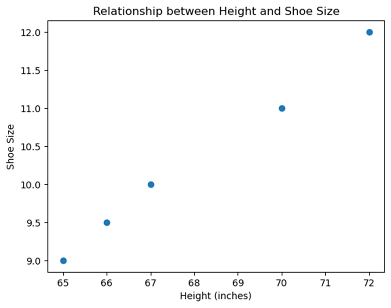
Let s consider the heights and shoe sizes of a group of students:
- Student 1: Height = 65 inches, Shoe Size = 9
- Student 2: Height = 70 inches, Shoe Size = 11
- Student 3: Height = 67 inches, Shoe Size = 10
- Student 4: Height = 72 inches, Shoe Size = 12
- Student 5: Height = 66 inches, Shoe Size = 9.5
If we plot this data on a graph, we might see a pattern suggesting that taller students tend to have bigger shoe sizes. But is this pattern meaningful, or could it be random?
Graph
Graph showing the relationship between height and shoe size
Real-World Example
A researcher observes that people who drink more coffee tend to have higher energy levels. However, this pattern might be random, or there could be another explanation, like people with naturally higher energy levels preferring coffee.
3. Identifying Questions: Possible Relationships in Data
Explanation
To analyze data effectively, we need to ask the right questions about possible relationships between variables. These questions guide our investigation and help us determine if what we observe is significant or just a coincidence.
Example Questions
- Is there a relationship between the number of hours studied and exam scores?
- Does the amount of exercise correlate with better sleep quality?
- Is there an association between social media use and stress levels?
Real-World Example
Suppose a school wants to know if there s a relationship between students attendance and their grades. They might ask, Does better attendance lead to higher grades? By asking this question, they can analyze the data to see if there s a meaningful relationship.
Free Response Problem
Question: A company wants to know if there s a relationship between the number of advertisements they run and the number of products they sell. Over ten weeks, they recorded the following data:
|
Week |
Number of Ads |
Products Sold |
|
1 |
5 |
100 |
|
2 |
10 |
150 |
|
3 |
7 |
120 |
|
4 |
8 |
130 |
|
5 |
6 |
110 |
|
6 |
12 |
160 |
|
7 |
9 |
140 |
|
8 |
11 |
155 |
|
9 |
4 |
90 |
|
10 |
13 |
170 |
Task:
- Plot the data on a graph.
- Determine if there is a pattern or association between the number of ads and the number of products sold.
- Is this relationship likely to be random or not? Explain your reasoning.
Answer Guide
- Students should plot the number of ads on the x-axis and the number of products sold on the y-axis.
- They should look for a pattern, such as an increasing trend.
- Students should discuss whether this pattern suggests a real relationship or could be due to random variation.
This reading material should help you understand how to analyze data and recognize whether the patterns you see are meaningful or just random!
TOPIC 2.2 Representing Two Categorical Variables
Understanding Two Categorical Variables
1. Comparing Numerical and Graphical Representations
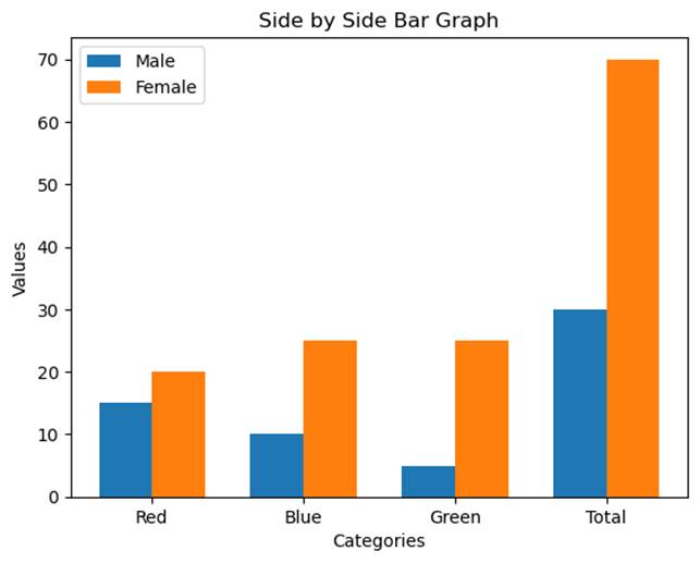
When working with two categorical variables, it's important to understand how to compare them using both numerical and graphical representations. Categorical variables are those that represent categories or groups, like "Gender" (Male, Female) or "Favorite Color" (Red, Blue, Green).
Numerical Representation: This is often done using a two-way table (or contingency table). This table shows how often different combinations of the categories occur. For example, if we survey 100 students about their gender and favorite color, a two-way table can summarize the responses.
Example:
|
Red |
Blue |
Green |
Total |
|
|
Male |
15 |
10 |
5 |
30 |
|
Female |
20 |
25 |
25 |
70 |
|
Total |
35 |
35 |
30 |
100 |
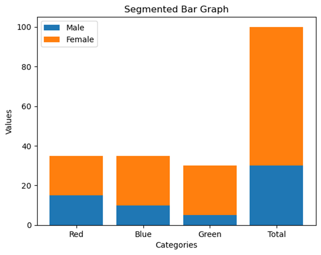
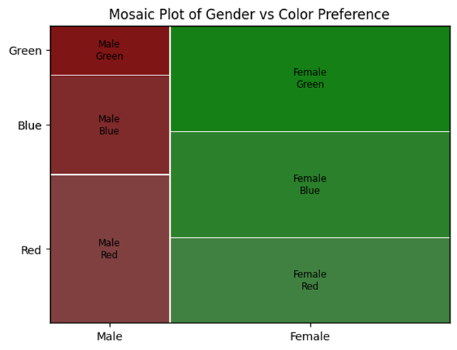
Graphical Representation: To visualize the relationship between these two variables, we can use graphs such as side-by-side bar graphs, segmented bar graphs, or mosaic plots. Each of these graphs provides a way to visually compare the distributions of the categories.
2. Types of Graphical Representations
Let s dive into the three main types of graphical representations used for two categorical variables:
a) Side-by-Side Bar Graphs
In a side-by-side bar graph, bars for one categorical variable are placed next to each other, grouped by the categories of another variable.
Example: A side-by-side bar graph showing gender and favorite color might look like this:
b) Segmented Bar Graphs
In a segmented bar graph, each bar represents one category of a variable and is divided into segments that represent the categories of the second variable.
Example: A segmented bar graph for gender and favorite color:
c) Mosaic Plots
A mosaic plot is a graphical representation where the size of each rectangle is proportional to the frequency or relative frequency of that combination of categories.
Example: A mosaic plot for gender and favorite color:
3. Comparing Distributions and Determining Associations
These graphical representations help us compare the distributions of two categorical variables and determine if there is an association between them.
- Comparing Distributions: By looking at the bar heights or rectangle sizes in the graphs, we can see if one category is more common in one group than another.
- Determining Associations: If the distribution of one variable changes significantly depending on the category of the other variable, it suggests that the two variables may be associated.
4. Two-Way Tables (Contingency Tables)
A two-way table is a simple but powerful tool to summarize two categorical variables. The cells in the table can show frequency counts or relative frequencies (proportions).
Example: In the two-way table shown earlier, the cell for Male, Red shows a frequency of 15. If we wanted the relative frequency, we'd divide 15 by the total number of students (100), giving us 0.15.
5. Joint Relative Frequency
The joint relative frequency is found by dividing the frequency in a cell by the total number of observations. It tells us how often a particular combination of categories occurs.
Example: For the "Male, Red" category, the joint relative frequency is 15/100 = 0.15 or 15%.
Real-World Example
School Clubs and Sports Participation: Suppose we want to see if there is an association between students participating in school clubs and playing sports. We survey 200 students and create the following two-way table:
|
Plays Sports |
Does Not Play Sports |
Total |
|
|
In a Club |
60 |
40 |
100 |
|
Not in a Club |
20 |
80 |
100 |
|
Total |
80 |
120 |
200 |
- Side-by-Side Bar Graph: Shows the number of students in each group.
- Segmented Bar Graph: Could show the proportion of students playing sports within each club participation category.
- Mosaic Plot: Would show the relationship between club participation and sports playing in terms of area size.
These graphs help us see if being in a club is associated with playing sports.
Free Response Problem
Problem: A survey of 150 students asks about their favorite type of movie (Action, Comedy, Drama) and whether they prefer watching movies at home or in theaters. The data is summarized below:
|
Action |
Comedy |
Drama |
Total |
|
|
Watch at Home |
30 |
20 |
10 |
60 |
|
Watch in Theaters |
20 |
40 |
30 |
90 |
|
Total |
50 |
60 |
40 |
150 |
- Create a side-by-side bar graph for the data.
- Calculate the joint relative frequency for students who prefer watching Action movies at home.
- Discuss whether there is an association between the type of movie and where students prefer to watch movies.
This reading material should give you a strong understanding of how to represent and analyze two categorical variables. Practice using these tools and graphs to strengthen your statistical skills!
TOPIC 2.3 Statistics for Two Categorical Variables
1. Introduction to Two Categorical Variables
In statistics, we often collect data that falls into different categories. When we study two categorical variables simultaneously, we can use a two-way table to organize and analyze the data. This allows us to observe patterns and relationships between the two variables.
2. Calculating Statistics for Two Categorical Variables
Let's start by understanding how to calculate basic statistics from a two-way table. A two-way table displays data that classifies individuals by two categorical variables.
Example:
Suppose we survey 100 students about their preferred study method (Group Study
or Individual Study) and their grade level (Underclassmen or Upperclassmen).
Here is the data:
|
Group Study |
Individual Study |
Total |
|
|
Underclassmen |
20 |
30 |
50 |
|
Upperclassmen |
15 |
35 |
50 |
|
Total |
35 |
65 |
100 |
3. Marginal Relative Frequencies
Marginal relative frequencies represent the proportion of individuals that fall into each category for one variable, without considering the other variable. They are calculated by dividing the row or column totals by the overall total.
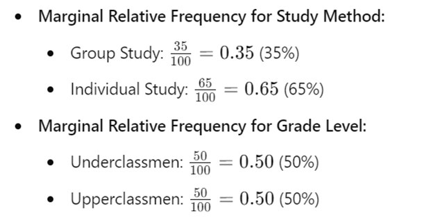
This tells us that 35% of students prefer group study, while 65% prefer individual study. Similarly, 50% of the surveyed students are underclassmen, and 50% are upperclassmen.
4. Conditional Relative Frequencies
Conditional relative frequencies focus on a specific subgroup of the data. It s calculated by dividing the frequency of a cell by the total of its row or column.

These calculations help us understand the relationship between the variables.
5. Comparing Statistics for Two Categorical Variables
To compare statistics for two categorical variables, we analyze the marginal and conditional relative frequencies. For instance, by comparing the preferences for study methods between underclassmen and upperclassmen, we can see if there's an association between grade level and study preference.
6. Real-World Example: Voting Preferences
Imagine we want to understand voting preferences in a town based on age. We survey 200 people and ask them whether they prefer Candidate A or Candidate B. We also note whether they are under 30 or 30 and older.
|
Candidate A |
Candidate B |
Total |
|
|
Under 30 |
60 |
40 |
100 |
|
30 and Up |
50 |
50 |
100 |
|
Total |
110 |
90 |
200 |
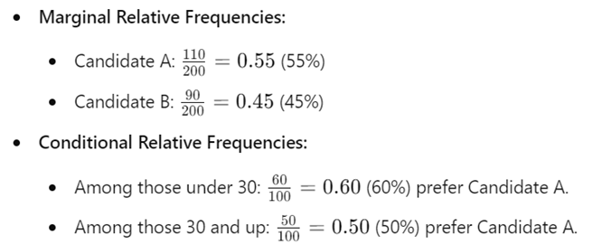
This shows that younger voters are more likely to prefer Candidate A compared to older voters.
7. Graphical Representation
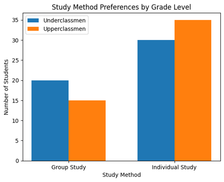
Let s visualize the data from our student survey:
8. Free Response Problem
Problem:
A company wants to understand whether employees' job satisfaction is related to
their department. The company surveys 150 employees, recording whether they are
satisfied or not, and whether they work in the Sales or Marketing department.
|
Satisfied |
Not Satisfied |
Total |
|
|
Sales |
40 |
35 |
75 |
|
Marketing |
30 |
45 |
75 |
|
Total |
70 |
80 |
150 |
- Questions:
- Calculate the marginal relative frequencies for job satisfaction.
- Calculate the conditional relative frequency of being satisfied among Sales employees.
- Compare the job satisfaction between Sales and Marketing departments.
- What can you conclude about the association between job satisfaction and department?
Answer these questions and summarize your findings in a few sentences.
TOPIC 2.4 Representing the Relationship Between Two Quantitative Variables
1. What is Bivariate Quantitative Data?
Bivariate quantitative data involves observing two different quantitative variables for each individual in a sample or population. For example, imagine you collect data on the number of hours students study and their corresponding scores on a test. Here, "hours studied" and "test scores" are the two quantitative variables.
Data Example:
Let's consider a small dataset where we observe the hours studied and test scores for five students:
|
Student |
Hours Studied |
Test Score (%) |
|
1 |
2 |
70 |
|
2 |
4 |
75 |
|
3 |
6 |
85 |
|
4 |
8 |
90 |
|
5 |
10 |
95 |
Here, "Hours Studied" is one variable, and "Test Score" is another. Together, they form a bivariate dataset.
2. What is a Scatterplot?
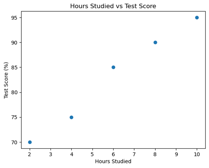
A scatterplot is a graph that represents bivariate data. Each point on the scatterplot corresponds to an observation in the dataset, with the x-axis representing one variable and the y-axis representing the other.
Example:
Using the data from our previous example, we can plot a scatterplot where "Hours Studied" is on the x-axis and "Test Score" is on the y-axis.
3. Explanatory and Response Variables
In a bivariate dataset, we often try to understand how one variable affects another. The explanatory variable (or independent variable) is the variable we use to explain or predict the other variable. The response variable (or dependent variable) is the one that we are trying to predict or explain.
Example:
- Explanatory Variable: Hours Studied
- Response Variable: Test Score
In our example, we might want to see if the number of hours studied (explanatory variable) can help predict a student's test score (response variable).
4. Characteristics of a Scatterplot
When analyzing a scatterplot, we look for the following characteristics:
- Form: Is the relationship linear (points roughly form a straight line) or non-linear?
- Direction: Does the relationship have a positive direction (as one variable increases, so does the other) or a negative direction (as one variable increases, the other decreases)?
- Strength: How closely do the points follow a specific pattern? Is the association strong, moderate, or weak?
- Unusual Features: Are there any outliers (points that don't fit the pattern) or clusters?
Example Analysis:
- Form: The scatterplot shows a linear relationship.
- Direction: The relationship is positive, meaning as "Hours Studied" increases, "Test Score" also increases.
- Strength: The points are closely clustered around a straight line, indicating a strong relationship.
- Unusual Features: No outliers are observed in this scatterplot.
Regression Models and Predictions
Regression models are tools that help us understand and predict the relationship between two quantitative variables. By using these models, we can make predictions about the response variable based on changes in the explanatory variable.
Key Points:
- Purpose of Regression Models:
- Regression models estimate the relationship between an explanatory variable and a response variable.
- They provide a way to predict the value of the response variable for a given value of the explanatory variable.
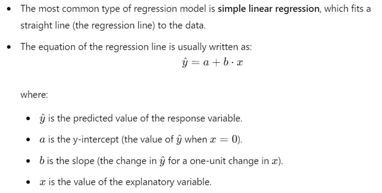
- Simple Linear Regression:
- Making Predictions:

- Interpreting the Slope and Intercept:
- The slope (b) indicates how much the response variable is expected to change with a one-unit change in the explanatory variable.
- The intercept (a) represents the expected value of the response variable when the explanatory variable is zero.
- Limitations and Assumptions:
- The regression model assumes a linear relationship between the explanatory and response variables.
- Predictions are most accurate within the range of the observed data. Extrapolation (predicting beyond the observed range) can be less reliable.
5. Real-World Example:
Let's consider a real-world scenario where a researcher wants to explore the relationship between the number of hours people exercise per week and their cholesterol levels. The researcher gathers data from 100 individuals and creates a scatterplot.
In the scatterplot, the x-axis represents the hours of exercise, and the y-axis represents cholesterol levels. If the scatterplot shows a negative direction, it might suggest that as people exercise more, their cholesterol levels tend to decrease, indicating a potential negative association between these two variables.
6. Free-Response Problem:
Problem:
A teacher gathers data on the number of hours students spend on homework each
week and their corresponding GPA. The data for 10 students is as follows:
|
Student |
Hours of Homework |
GPA |
|
1 |
3 |
2.5 |
|
2 |
5 |
3.0 |
|
3 |
7 |
3.5 |
|
4 |
4 |
3.0 |
|
5 |
6 |
3.2 |
|
6 |
8 |
3.7 |
|
7 |
2 |
2.2 |
|
8 |
9 |
3.8 |
|
9 |
10 |
4.0 |
|
10 |
1 |
2.0 |
- a. Construct a scatterplot for this data with "Hours of Homework" on the x-axis and "GPA" on the y-axis.
- b. Describe the form, direction, strength, and any unusual features of the scatterplot.
- c. Based on the scatterplot, what conclusions can you draw about the relationship between hours spent on homework and GPA?
This material provides a foundation for understanding how to represent and interpret the relationship between two quantitative variables using scatterplots. Use the data and real-world examples to guide your understanding, and try solving the free-response problem to practice your skills!
TOPIC 2.5 Correlation
Introduction
In statistics, correlation is a measure that describes the relationship between two quantitative variables. When we study how one variable changes in relation to another, we often look at the correlation to understand the strength and direction of this relationship. In this reading material, we will explore how correlation is calculated, how to interpret it, and some important considerations when using correlation in data analysis.
1. Regression Models and Predicting Responses
A regression model helps us predict the value of one variable (the response variable) based on the value of another variable (the explanatory variable). For example, if we have data on students study hours and their test scores, we might use a regression model to predict a student s test score based on how many hours they studied.
Data Example: Imagine you have the following data:
|
Study Hours |
Test Score |
|
2 |
70 |
|
4 |
80 |
|
6 |
90 |
|
8 |
95 |
A regression model might show that for every additional hour of study, the test score increases by a certain amount. This allows us to make predictions about future test scores based on study hours.
Real-World Example: Consider the relationship between the temperature outside and the sales of ice cream. A regression model could predict ice cream sales based on the temperature. As the temperature increases, ice cream sales might also increase, showing a positive relationship.
2. Determining Correlation for a Linear Relationship
Correlation quantifies the strength and direction of the linear relationship between two variables. The correlation coefficient, denoted as r, ranges from -1 to 1.
- r > 0: Positive correlation (as one variable increases, the other also increases).
- r < 0: Negative correlation (as one variable increases, the other decreases).
- r = 0: No linear correlation.
Graph Example: Let's create a scatterplot with two variables: study hours and test scores.
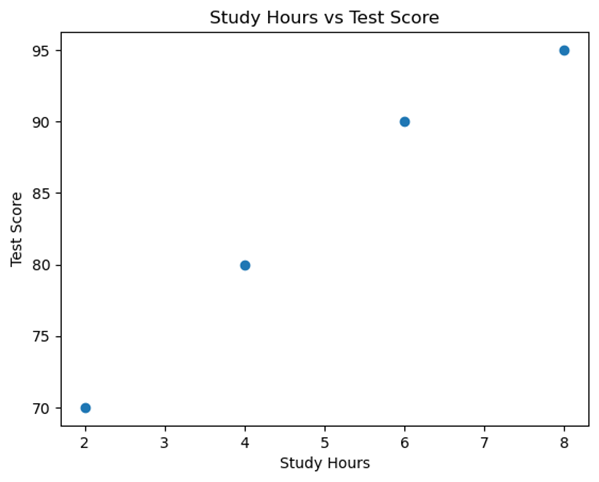
The scatterplot shows a positive linear relationship, meaning that as study hours increase, test scores tend to increase as well.
3. Understanding the Correlation Coefficient (r)
The correlation coefficient r tells us two things:
- Direction: Whether the relationship is positive or negative.
- Strength: How strong the relationship is (how close the points are to a straight line).
Example:
- r = 0.9: Strong positive correlation.
- r = -0.8: Strong negative correlation.
- r = 0.2: Weak positive correlation.
The closer r is to 1 or -1, the stronger the relationship. However, it s important to remember that a high correlation does not mean one variable causes the other to change.
4. Calculating the Correlation Coefficient
While the formula for calculating r involves some complex calculations, most often, we use technology (like a calculator or software) to find it. The formula is:


5. Interpreting the Correlation Coefficient
When interpreting r, consider the following:
- r = 1 or r = -1: Perfect linear relationship.
- r = 0: No linear relationship.
- A strong correlation does not mean that a linear model is the best fit for the data. Always plot the data to check the shape of the relationship.
Example: Suppose r = 0.95 for study hours and test scores. This indicates a strong positive relationship, meaning that generally, students who study more tend to have higher test scores.
6. Correlation vs. Causation
A key concept in statistics is that correlation does not imply causation. Just because two variables are correlated does not mean that one causes the other to change.
Example: Imagine a study shows a correlation between ice cream sales and drowning incidents. This does not mean that buying ice cream causes drowning. Instead, a third variable (like hot weather) might cause both to increase.
Free Response Problem
Problem:
A researcher collected data on the number of hours spent exercising per week
and the cholesterol levels of a group of adults. The correlation coefficient
between the two variables was found to be r = -0.85.
- a. Describe the direction and strength of the relationship between exercise and cholesterol levels.
- b. Does this correlation imply that more exercise causes lower cholesterol levels? Explain your reasoning.
- c. If the researcher finds that the relationship is non-linear, what should they do?
Solution:
- a. The correlation is negative and strong, suggesting that as the number of hours spent exercising increases, cholesterol levels tend to decrease.
- b. No, this correlation does not imply causation. Other factors could contribute to lower cholesterol levels.
- c. If the relationship is non-linear, the researcher should consider a different model, such as a quadratic or exponential model, to better fit the data.
Conclusion Understanding correlation helps us explore and interpret relationships between variables. However, always remember the limitations of correlation and the importance of looking beyond the numbers to the context of the data.
TOPIC 2.6 Linear Regression Models
1. Understanding Linear Regression Models
A linear regression model helps us predict the value of a response variable y based on the value of an explanatory variable x. The relationship between x and y is modeled by a straight line, called the regression line. This line shows how changes in x are associated with changes in y.
2. The Regression Equation
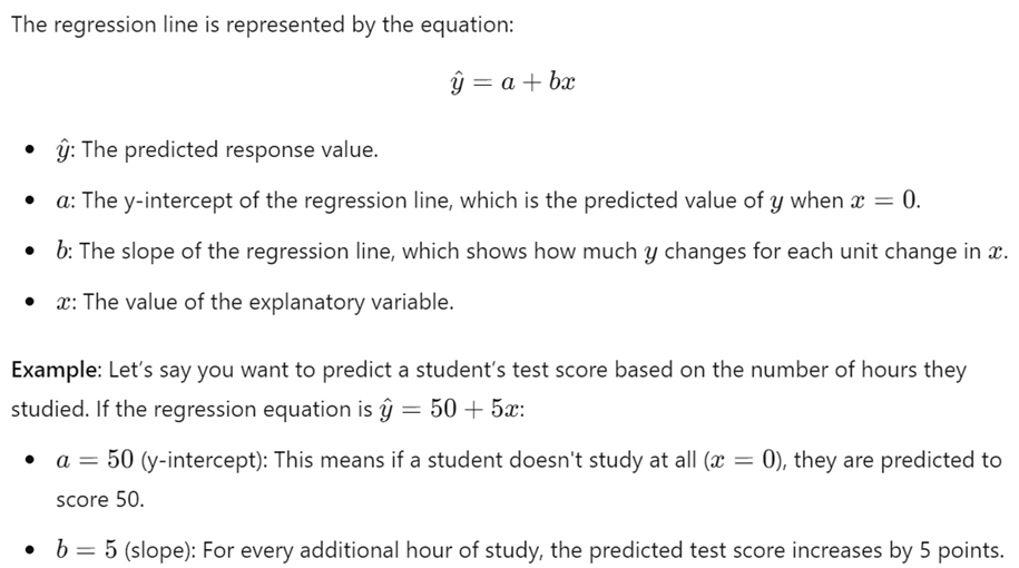
3. Calculating a Predicted Response Value

4. Real-World Example: Predicting House Prices
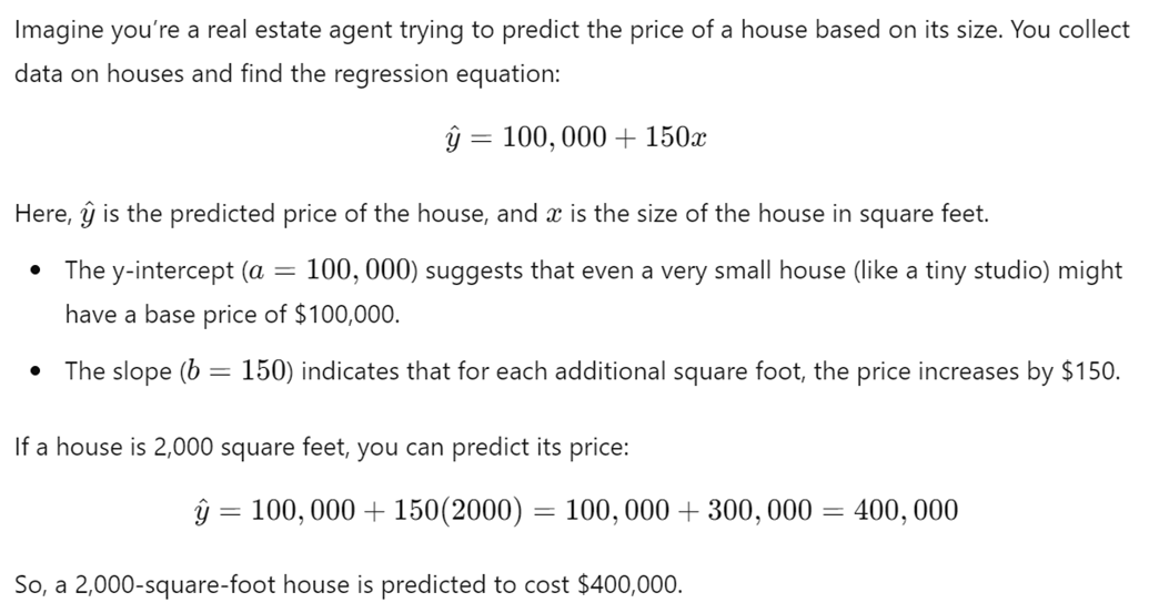
5. Understanding Extrapolation
Extrapolation involves using the regression model to predict y for an x-value that is outside the range of data used to create the model. This can be risky because the further we go beyond the data we have, the less reliable the prediction becomes.
Example: If the house size data you collected ranges from 1,000 to 3,000 square feet, predicting the price for a 5,000-square-foot house using the same equation could lead to an unreliable estimate. The relationship might not hold true for such a large house.
6. Visualizing the Concept
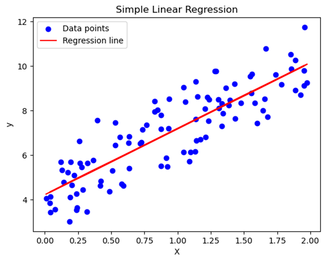
Below is a graph of a simple linear regression model with a regression line:
TOPIC 2.7 Residuals
What Are Residuals?
In statistics, a residual is the difference between an actual observed value (y) and a predicted value (y^\hat{y}y^) based on a regression model. Residuals help us understand how well our model fits the data. The formula for calculating a residual is:
![]()
- Example: If a student scores 85 on a test (actual value, y) and the predicted score based on study hours was 90 (y^\hat{y}y^), the residual would be:
Residual=85−90=−5
This means the student scored 5 points lower than predicted.
Residual Plots
A residual plot is a graph that shows residuals on the vertical axis and another variable (either the explanatory variable or the predicted response values) on the horizontal axis. Residual plots are a valuable tool for evaluating the fit of a regression model.
- Example: Suppose we have a regression model predicting students' test scores based on the number of study hours. We can create a residual plot to see if the model is appropriate.
Interpreting Residual Plots
- Apparent Randomness:
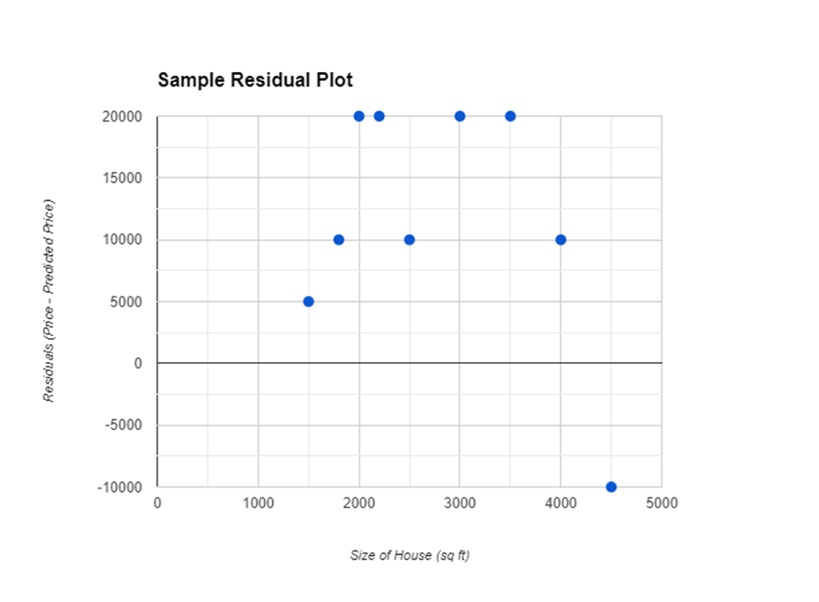
- If the residuals in the plot are scattered randomly around the horizontal axis (with no discernible pattern), it suggests that the model is a good fit for the data. This randomness indicates that the errors (or residuals) are equally spread out, confirming that a linear model is appropriate.
- Patterns in Residuals:
- If you see a pattern (such as a curve or clusters) in the residual plot, this suggests that the model may not be appropriate. Patterns can indicate that a linear model does not capture the relationship between the variables adequately, and a different model might be needed.
Real-World Example: Predicting House Prices
Let s say a real estate analyst is using the size of a house (in square feet) to predict its price. After building a linear regression model, the analyst calculates the residuals for each house in the dataset.
- Residual Plot: The analyst then creates a residual plot with the size of the house on the x-axis and the residuals on the y-axis. If the residual plot shows a random scatter of points, the linear model is appropriate. However, if there's a pattern (e.g., a curved trend), the analyst might consider a different model, like a quadratic or exponential model.
Here s a sample residual plot for better understanding:
Using Residual Plots to Evaluate Model Appropriateness
Residual plots help you decide if your chosen model is the best one for the data. If the residuals are random, your model is likely appropriate. If there s a pattern, you might need to explore different models.
Free Response Problem:
A company uses the number of years of experience to predict the salary of its employees. After fitting a linear regression model, they obtain the following data for three employees:
|
Employee |
Years of Experience (XXX) |
Actual Salary (yyy) |
Predicted Salary (y^\hat{y}y^) |
Residual (y−y^y - \hat{y}y−y^) |
|
1 |
2 |
$50,000 |
$52,000 |
|
|
2 |
5 |
$70,000 |
$68,000 |
|
|
3 |
10 |
$100,000 |
$98,000 |
- Calculate the residuals for each employee.
- Create a residual plot by plotting the residuals against the years of experience.
- Interpret the residual plot. Does it suggest that the linear model is appropriate? Why or why not?
This reading material provides a clear and simple understanding of residuals, engaging students with explanations, examples, and a problem to solve.
TOPIC 2.8 Least Squares Regression
Introduction
In statistics, one of the most powerful tools we use to understand the relationship between two quantitative variables is the least-squares regression line. This line allows us to make predictions and understand how changes in one variable might affect another. Let's break down the key concepts of least-squares regression in a simple, engaging way.
1. Estimating Parameters for the Least-Squares Regression Line Model
When we have two variables, say x (explanatory variable) and y (response variable), we often want to find the line that best fits the data points on a scatterplot. This line is called the least-squares regression line.
The parameters of this line include the slope and the y-intercept. These parameters help us understand how much y changes for a given change in x, and where the line crosses the y-axis.
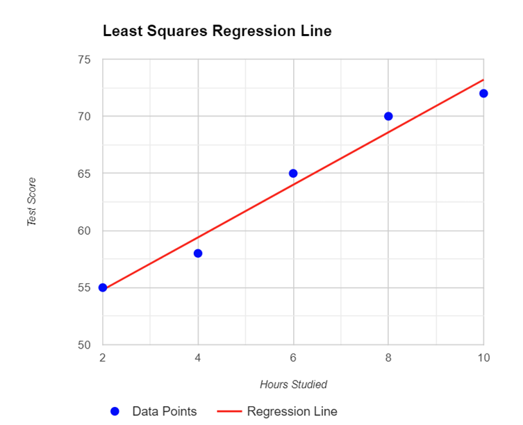
Data Example: Suppose we have data on the number of hours studied (x) and the scores on a test (y) for a group of students. We want to find the line that best predicts the test score based on hours studied.
2. The Least-Squares Regression Model Minimizes the Sum of the Squares of the Residuals
The least-squares regression line is special because it minimizes the sum of the squares of the residuals. A residual is the difference between the observed value (y) and the predicted value (ŷ) from the regression line. By squaring these differences and adding them up, we get a value that the regression model tries to minimize.
This line also passes through the point (x̄, ȳ), where x̄ is the mean of the x-values and ȳ is the mean of the y-values.
3. Calculating the Slope (b) of the Regression Line
4. Interpretation of the y-Intercept (a)

5. The Coefficient of Determination (r )
The coefficient of determination, denoted as r , is a measure of how well the regression line explains the variation in the response variable. It is the square of the correlation r and represents the proportion of variation in y that is explained by x.
6. Interpreting Coefficients of the Least-Squares Regression Line
The coefficients include the slope b and the y-intercept a. Understanding these coefficients helps us make predictions and understand the relationship between the variables.
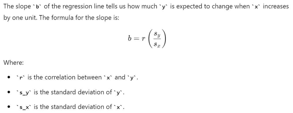
- Slope (b): Indicates the change in y for each one-unit increase in x.
- y-Intercept (a): Indicates the predicted value of y when x is 0, though sometimes it may not have a logical interpretation.
7. Sample Calculation
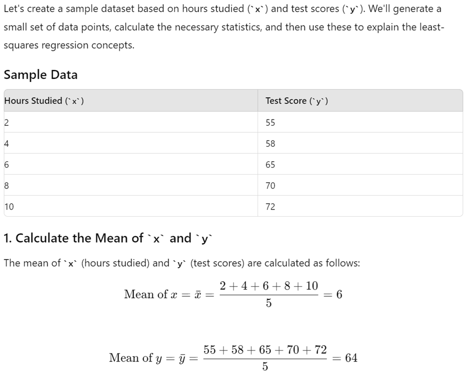
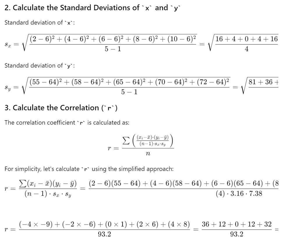
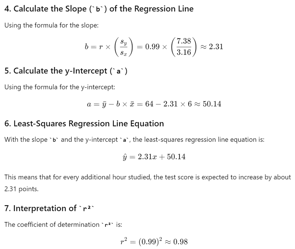
This indicates that 98% of the variation in test scores is explained by the number of hours studied.

TOPIC 2.9 Analyzing Departures from Linearity
Introduction
When analyzing data using linear regression, it s important to recognize points that don't follow the general trend. These points can affect the overall regression model, leading to inaccurate predictions. In this lesson, we will explore how to identify influential points, understand outliers, and leverage points, and how to use transformations to improve our regression models.
1. Identifying Influential Points in Regression
Influential Points are data points that, if removed, significantly change the result of the regression analysis. These changes could affect the slope, y-intercept, or the correlation of the regression line. Outliers and high-leverage points are often influential.
Example:
Imagine you have the following data set representing the relationship between the number of hours studied and test scores:
|
Hours Studied |
Test Score |
|
1 |
55 |
|
2 |
60 |
|
3 |
65 |
|
4 |
70 |
|
5 |
75 |
|
6 |
80 |
|
20 |
100 |
Here, the point (20, 100) could be an influential point because the x-value (20 hours) is much larger than the rest of the data points.
2. Understanding Outliers in Regression
Outliers are points that do not follow the general trend of the data and have a large residual when the Least Squares Regression Line (LSRL) is calculated. Residuals are the differences between the observed values and the values predicted by the regression line.
Example:
If you look at the same data set and plot the regression line, the point (20, 100) might be far away from the line, making it an outlier. This point will have a large residual because the actual test score is much higher than what the model would predict based on the other data points.
3. Understanding High-Leverage Points in Regression
High-Leverage Points have x-values that are much larger or smaller than those of other observations. These points can pull the regression line towards them, affecting the overall fit of the model.
Example:
In the previous data set, the point (20, 100) is also a high-leverage point because the x-value (20) is much higher than the other x-values (1-6). This point could strongly influence the slope of the regression line.
4. Understanding Influential Points in Regression
An Influential Point is any point that, when removed, changes the relationship between variables significantly. This change could affect the slope, y-intercept, and/or correlation of the regression line.
Real-World Example:
Imagine you're analyzing the relationship between advertising spending and sales revenue for a company. Most data points show that as advertising spending increases, so does sales revenue. However, one data point represents a situation where a significant amount was spent on a campaign, but the sales did not increase as expected. This point could be an influential point, especially if it drastically changes the regression line when removed.
5. Calculating a Predicted Response Using a Least-Squares Regression Line for a Transformed Data Set
Transforming data can help in fitting a more appropriate model when the original data does not follow a linear trend.
Example:
Suppose we have the following data set:
|
X (Explanatory Variable) |
Y (Response Variable) |
|
1 |
2 |
|
2 |
4 |
|
3 |
8 |
|
4 |
16 |
|
5 |
32 |
Here, the relationship between X and Y is exponential. By taking the natural logarithm of Y, we can transform the data to make it linear.
6. Transformations to Improve Linearity
By transforming variables, such as taking the natural logarithm of each value of the response variable or squaring each value of the explanatory variable, we can create transformed data sets that may better fit a linear model.
Example:
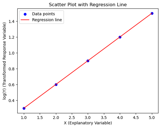
Using the previous data, we can create a new data set by taking the logarithm of Y:
|
X (Explanatory Variable) |
log(Y) (Transformed Response Variable) |
|
1 |
0.30 |
|
2 |
0.60 |
|
3 |
0.90 |
|
4 |
1.20 |
|
5 |
1.50 |
Now, the data follows a more linear pattern.
7. Interpreting Residual Plots After Transformation
After transforming data, we can analyze residual plots to determine if the transformation made the model more appropriate.
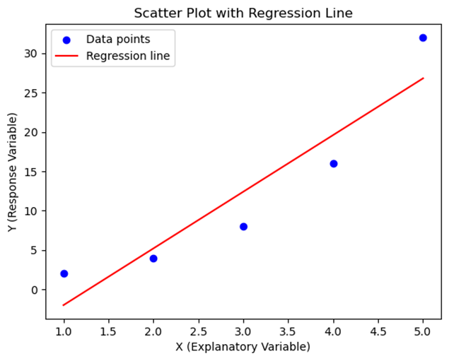
Graph:
Below is a graph that shows the original data points, the regression line before transformation, and the transformed regression line.
In this graph, the residuals for the transformed model are more randomly distributed, indicating a better fit.
Free Response Problem
Problem:
You have the following data set representing the number of hours spent on social media per day and the resulting productivity score out of 100:
|
Hours on Social Media |
Productivity Score |
|
1 |
90 |
|
2 |
85 |
|
3 |
75 |
|
4 |
65 |
|
5 |
60 |
|
6 |
55 |
|
15 |
50 |
- Identify any outliers, high-leverage points, and influential points in the data set.
- Transform the data set using the natural logarithm of the productivity score and plot the new data.
- Calculate the regression line for the transformed data and compare it with the original regression line.
- Discuss whether the transformation improved the model and explain why.
This reading material should help you understand how to identify and deal with influential points, outliers, and high-leverage points in regression analysis. By transforming data, you can often create more appropriate models that better predict outcomes.